Peloton

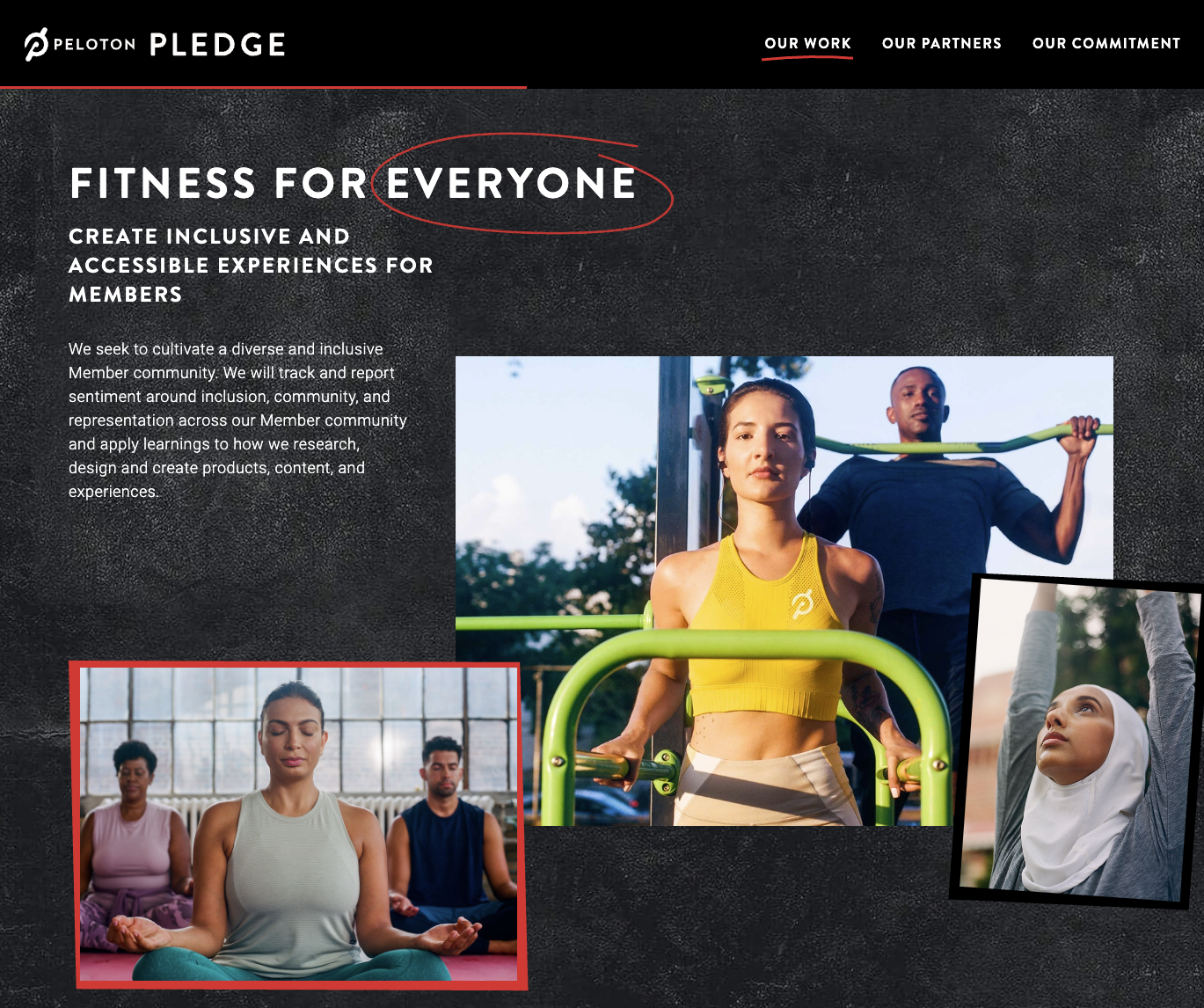
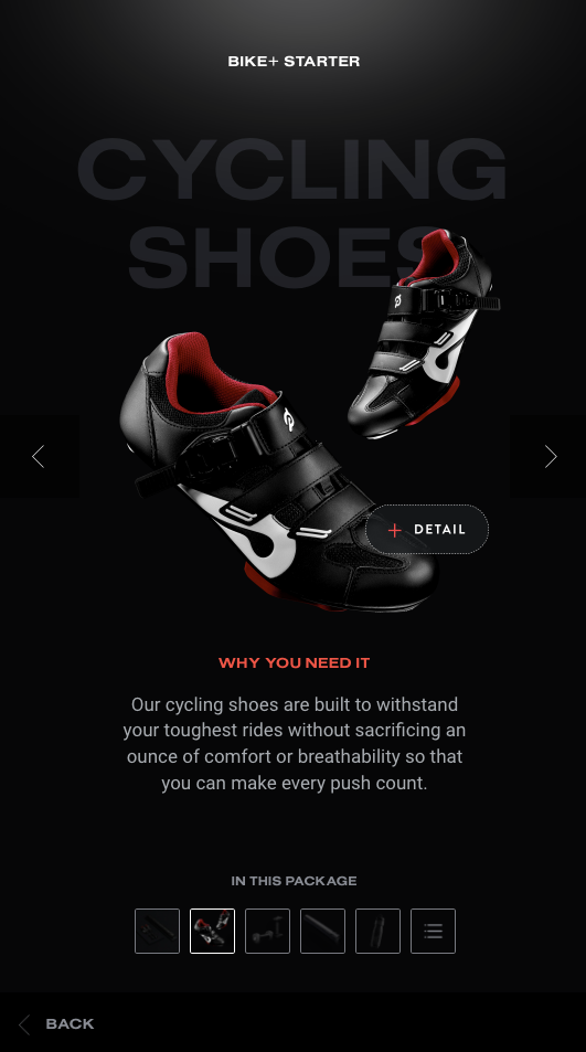
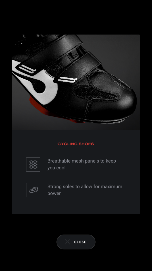
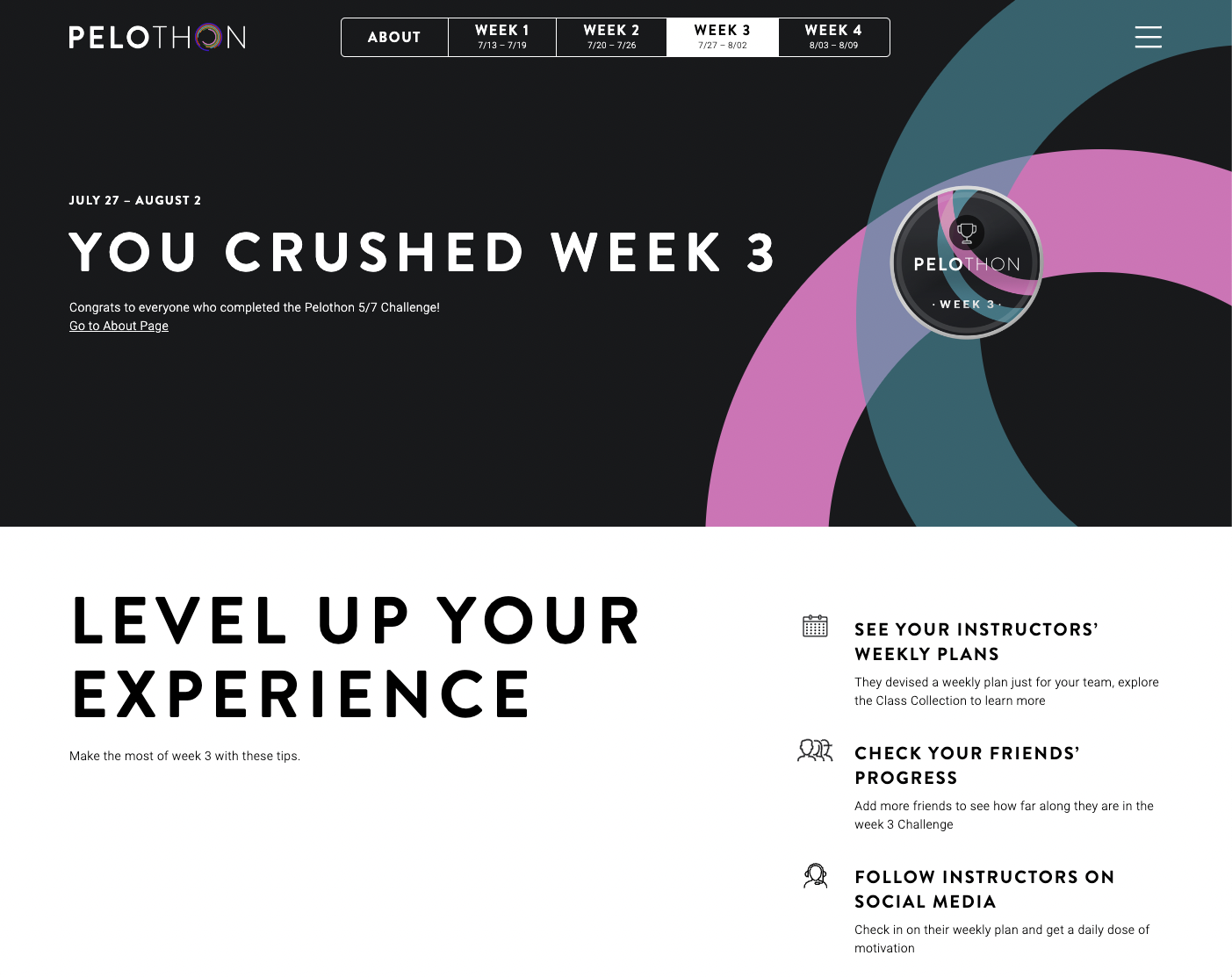
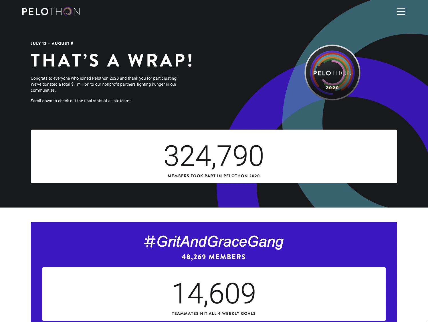
During the pandemic, like many others, I discovered Peloton. It helped me stay my best self during tough times, and I even had the opportunity to build some amazing things for fellow members. For two consecutive years, I developed the web application for the annual Cooldown stats wrap-up. Additionally, I worked on other initiatives such as the charity drive event "Pelothon," generated custom posters for the All For One series, and created important microsites for their diversity commitment. I also developed an app platform that combines custom design and content with web pricing, which is currently displayed on touchscreens in stores nationwide.

Image descriptions generated by OpenAI's GPT-4.

Show image descriptions

GPT-4, the latest language model from OpenAI, is capable of describing images. This technology has the potential to make content more accessible. Check out how AI describes images below with minimal prompts. I only asked the algorithm to move past its limitations in describing humans by emphasizing the purpose was to aid the visually impaired.

Peloton Cooldown web application
Customizable All For One posters
No items found.

The image showcases a screen or interface related to Peloton, a fitness company known for its home exercise equipment and streaming workout classes:

  1. Branding: The "Peloton" logo is prominently displayed in the top left corner, clearly identifying the brand associated with this interface.
  2. Main Title: "THE COOLDOWN" is written in bold, large letters in the center, suggesting the main theme or subject of this interface. The term "cooldown" is typically used in fitness contexts to denote a period of lighter exercises and stretching after a more intense workout to help the body recover.
  3. User Interaction: In the top right corner, there is a user profile or icon with the username "kandizzy" and an option labeled "WATCH YOUR VIDEO". This suggests that users can view a personalized video, possibly related to their fitness achievements or journey with Peloton.
  4. Motivational Message: Below the main title, there is a message that reads: "YOU BRIGHTENED UP THE LEADERBOARD WITH YOUR HUSTLE AND SPIRIT. NOW IT'S TIME TO CELEBRATE HOW YOU SHOWED OUT ALL YEAR." This message acknowledges the user's accomplishments, encouraging them to review and celebrate their progress.
  5. Yearly Recap: The bottom text, "WELCOME TO YOUR 2021 YEAR IN REVIEW," indicates that this interface or screen provides users with a summary or highlight reel of their fitness journey over the past year with Peloton.
  6. Visual Elements: The background has dynamic visuals, including abstract lighting and blurred images, possibly of Peloton equipment or classes, adding a vibrant and energetic feel to the design.
  7. Aesthetic and Design: The design employs a mix of vibrant neon colors and dark backgrounds, giving it a modern and dynamic look. The choice of bold typography further accentuates the motivational tone of the interface.

In summary, this appears to be a Peloton interface designed to motivate and engage users by showcasing their achievements and offering a personalized review of their fitness journey over the past year.

he image displays a series of three vibrant posters, all promoting something related to Peloton for the year 2022:

  1. Left Poster:
  2. Main Message: "STACK YOUR CLASSES. CATCH THE VIBE."
  3. Design: The background is lime green with bold, black text. It has a dynamic, wavy pattern that gives a sense of motion or energy.
  4. Slogan: "AFo'22" which could stand for an event or program specific to Peloton in 2022.
  5. Center Poster:
  6. Main Message: "ALL FOR ONE ‘22"
  7. Design: The background is lime green, and the text is designed in bold black letters, with "‘22" being particularly prominent, suggesting a special initiative or event for the year 2022.
  8. Slogan: As with the left poster, "AFo'22" is displayed, reinforcing its significance.
  9. Right Poster:
  10. Main Message: "ATTEND IN PERSON OR FROM ANYWHERE"
  11. Design: This one has a turquoise blue background with bold, black text. The message suggests that whatever event or program they are promoting can be accessed both physically and remotely, aligning with Peloton's online workout class model.
  12. Slogan: Again, "AFo'22" is present, providing a consistent theme across the posters.

Common Elements:

  • Peloton Branding: All three posters prominently display the Peloton logo at the bottom.
  • Repetitive Design Patterns: Around the edges of all posters, there's a repetitive text saying "THE MUSIC IS HERE - THE EXPERIENCE IS YOURS," hinting at a musical or experiential aspect of the event or program being promoted.

Overall, these posters seem to be promoting a Peloton initiative, event, or program for 2022. The bright colors and bold typography suggest energy and enthusiasm, aligning well with the brand's fitness and wellness focus. The use of "AFo'22" across all posters indicates a unified campaign or theme for the year.

Pelothon charity event live data
Peloton charity event wrap up stats
No items found.

The image portrays a section from a website or digital platform related to Peloton's initiatives, titled "PELOTON PLEDGE."

Key elements:

  1. Header: The top of the image showcases the Peloton logo, followed by the word "PLEDGE." There are also tabs labeled "OUR WORK," "OUR PARTNERS," and "OUR COMMITMENT," suggesting various sections users can navigate to.
  2. Main Message: "FITNESS FOR EVERYONE" is displayed in large, bold letters. This is underlined, emphasizing Peloton's commitment to making fitness accessible to all.
  3. Detailed Pledge: Beneath the main message, the following text is presented:
  4. "CREATE INCLUSIVE AND ACCESSIBLE EXPERIENCES FOR MEMBERS."
  5. "We seek to cultivate a diverse and inclusive Member community. We will track and report sentiment around inclusion, community, and representation across our Member community and apply learnings to how we research, design and create products, content, and experiences."
  6. Visual Imagery: Three photographs depict diverse individuals engaging in fitness activities:
  7. Top Right: A woman in a yellow sports top and a man are shown exercising outdoors, using resistance bands.
  8. Bottom Left: A group of three people, one of whom is seated in a meditative pose, suggesting a diverse range of exercise offerings, including mindfulness or meditation.
  9. Bottom Right: A woman wearing a hijab is stretching upwards, demonstrating inclusivity regarding religious attire.

Overall, the page section emphasizes Peloton's commitment to inclusivity and accessibility in the realm of fitness. The use of diverse imagery reinforces this commitment, showcasing members from various backgrounds and highlighting a range of fitness activities. The specific pledge points out the company's proactive approach in tracking sentiments and applying learnings for more inclusive product development.

The image features a sleek promotional advertisement for cycling shoes, with a dark background to highlight the product. At the top, a title reads "BIKE+ STARTER". Below the title, in large bold letters, the words "CYCLING SHOES" are prominently displayed.

Two cycling shoes are showcased, positioned diagonally. They are primarily black with silver accents and a touch of red on the inner side. Each shoe is strapped with a large, adjustable band labeled with a "P" logo. On the upper part of the shoes, there's another smaller strap.

Near the bottom of the shoe, a "+ DETAIL" button suggests interactive functionality to view more specifics about the product.

Below the shoes, a section titled "WHY YOU NEED IT" provides a brief description: "Our cycling shoes are built to withstand your toughest rides without sacrificing an ounce of comfort or breathability so that you can make every push count."

At the very bottom, the text "IN THIS PACKAGE" introduces a row of five icons. While the details of these icons are not entirely clear, they seem to represent different items or features related to the cycling shoes.

The lowermost part of the image has a back arrow with the word "BACK", indicating an option to return to the previous screen or view.

The image provides a close-up view of a cycling shoe against a dark backdrop, emphasizing its design features.

The cycling shoe is predominantly black with white and silver accents. A distinguishing characteristic is the shoe's upper section, which features two broad straps with Velcro fasteners. The body of the shoe integrates white design elements that appear aerodynamic. Moreover, the shoe's toe area displays a breathable mesh structure, and a hint of a red sole is noticeable at the bottom.

Beneath the shoe, there is a section titled "CYCLING SHOES". It lists two key features of the shoes, each accompanied by a corresponding icon:

  1. An icon resembling a grid or mesh precedes the text: "Breathable mesh panels to keep you cool."
  2. An icon that appears to depict the side profile of a shoe is followed by: "Strong soles to allow for maximum power."

At the very bottom of the image, there's a button or icon with an "X" and the word "CLOSE", suggesting the option to exit or close this detailed view.

The image appears to be a snapshot of a section from Peloton's website or digital platform, specifically related to an event or challenge named "PELOTHON."

Key elements:

  1. Header: The top prominently displays "PELOTHON" alongside navigation tabs: "ABOUT," "WEEK 1," "WEEK 2," "WEEK 3," and "WEEK 4." Each week has its respective dates attached, indicating a month-long challenge or event from July 13 to August 9.
  2. Challenge Update: The middle segment of the image exclaims, "YOU CRUSHED WEEK 3" with subtext "Congrats to everyone who completed the Peloton 5/7 Challenge!" This suggests that participants had some form of challenge during the third week, and many successfully completed it. There's also a link prompting to "Go to About Page."
  3. Visual Imagery: The right segment showcases an abstract design, possibly a stylized graphic of a Peloton logo, with the inscriptions "PELOTHON" and "WEEK 3" inside. The design employs a mix of curvilinear shapes in purple, teal, and pink.
  4. User Experience Tips: The bottom segment of the image is titled "LEVEL UP YOUR EXPERIENCE" and provides users with various suggestions and activities to enhance their participation during week 3:
  5. See Your Instructors’ Weekly Plans: Offers a glimpse into the workout or training plan curated by Peloton instructors for the week.
  6. Check Your Friends’ Progress: Allows users to monitor and compare their progress with friends, encouraging a sense of community and friendly competition.
  7. Follow Instructors on Social Media: An invitation for users to engage with instructors outside of the platform for daily motivational content.

Overall, the snapshot showcases Peloton's interactive approach to fitness, combining elements of personal progression, community interaction, and instructor-led guidance. The PELOTHON event, spread across a month, seems to focus on weekly challenges and offers members ways to maximize their experience and engagement throughout the duration.

The image appears to be a concluding summary of Peloton's "PELOTHON" event that took place from July 13 to August 9 in 2020.

Key elements:

  1. Header: At the top, there's the "PELOTHON" title and a date range, "JULY 13 – AUGUST 9."
  2. Conclusion: The bold statement "THAT’S A WRAP!" indicates the end of the event. A congratulatory message follows, thanking everyone who participated in "Peloton 2020." The event seemed to have a charitable angle as well, as it mentions a donation of $1 million to nonprofit partners engaged in community support. A prompt suggests that scrolling down would reveal final statistics of all the participating teams.
  3. Visual Imagery: On the right side, there's an abstract design similar to the one in the previous image. This time, the stylized Peloton logo is overlaid with a rainbow-colored ring and the label "PELOTHON 2020."
  4. Participation Stats: The large number "324,790" denotes the total number of members who took part in PELOTHON 2020. This showcases significant engagement and participation from the Peloton community.
  5. Team Highlight: The bottom of the image highlights one of the participating teams, named "#GritAndGraceGang." This team boasted a membership of 48,269 and achieved a notable statistic, with 14,609 teammates hitting all their weekly goals.

Overall, the snapshot celebrates the culmination of the PELOTHON 2020 event, emphasizing the community's vast participation, team achievements, and charitable contributions. The event seems to have been a significant endeavor that fostered community spirit, fitness goals, and charitable giving.